
- Pregnancy
- Baby & Toddler
- Parents
- Getting Pregnant
- Baby Names
- Product Reviews
-
Registry
- Community
-
More
Want a personalized experience?
Download the free app


October 2012 Moms
 Petunia844
member
Petunia844
member


Married the love of my life 7/11/09 - Our first baby, Peyton Mark, was born sleeping 10/25/11 at 33 weeks - Our second baby, BFP 2/4/12, welcome to the world Raylan! Holy Moly, BPF 2/4/14, please be safe and sound little one!
Can I ask your opinion?
Petunia844
member
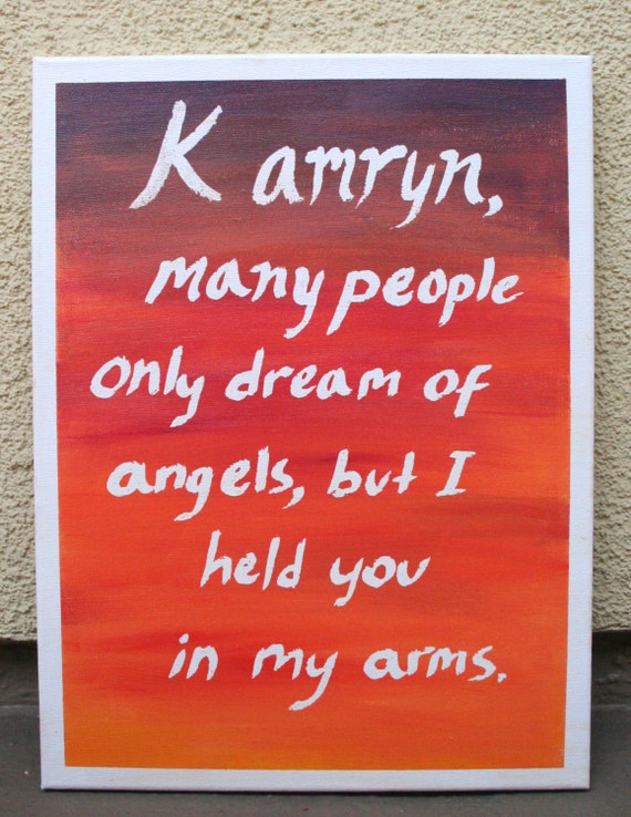
I'm working on the new section of my Etsy I mentioned and this is one of my paintings in progress
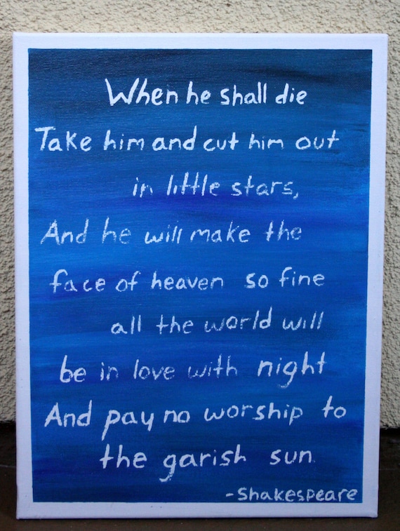
I used this stuff that you white out what you want white then paint over it...the problem is with a quote this long I think it has to be on there too long and the writing is too small for it to come off quite right. I like the background....but I think to have such a solid painted background the writing may just look kind of broken like this. So be honest, do I need to find a new technique for this one or do you think it looks intentional? I'm torn between thinking it kind of looks like stars and just thinking it looks unfinished. For comparison, here's one with a shorter quote that looks how it should.
Married the love of my life 7/11/09 - Our first baby, Peyton Mark, was born sleeping 10/25/11 at 33 weeks - Our second baby, BFP 2/4/12, welcome to the world Raylan! Holy Moly, BPF 2/4/14, please be safe and sound little one!
My Blog
This discussion has been closed.
Re: Can I ask your opinion?
Married the love of my life 7/11/09 - Our first baby, Peyton Mark, was born sleeping 10/25/11 at 33 weeks - Our second baby, BFP 2/4/12, welcome to the world Raylan! Holy Moly, BPF 2/4/14, please be safe and sound little one!
My Blog
Sorry! Ha!
I used this stuff that you white out what you want white then paint over it...the problem is with a quote this long I think it has to be on there too long and the writing is too small for it to come off quite right. I like the background....but I think to have such a solid painted background the writing may just look kind of broken like this. So be honest, do I need to find a new technique for this one or do you think it looks intentional? I'm torn between thinking it kind of looks like stars and just thinking it looks unfinished. For comparison, here's one with a shorter quote that looks how it should.
Married the love of my life 7/11/09 - Our first baby, Peyton Mark, was born sleeping 10/25/11 at 33 weeks - Our second baby, BFP 2/4/12, welcome to the world Raylan! Holy Moly, BPF 2/4/14, please be safe and sound little one!
My Blog
Married the love of my life 7/11/09 - Our first baby, Peyton Mark, was born sleeping 10/25/11 at 33 weeks - Our second baby, BFP 2/4/12, welcome to the world Raylan! Holy Moly, BPF 2/4/14, please be safe and sound little one!
My Blog
I think the backgrounds are very cool for both. I like each color palette and the blending you do.
And I might be of contradictory opinion, but I actually prefer the blue/longer piece because to me, the warmer colors' quote and presentation seem more cookie-cutter. There's more originality in the blue one to me. And I like the lettering as it turned out. It makes it feel original and unique because of the imperfections.